Sunday 24 October 2010

3D Scene.

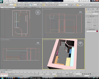
For my 3D Module Assignment, I have decided to go ahead and learn 3DS Max by building a stage in which my fish animation will take place. Using a lot of trial and error, and some notes from class, here is the process I went through:
Firstly I drew out a scaled floor plan of my dorm room using my knowledge of AutoCad, and then went on to add 3D walls based on that plan. After the basic walls was finished, I added simple detail that would later become the bed, closet and pipe duct in my room:
(Click to enlarge images)

Here I continue to add more detail, such as the desk and then door holes:

 And then some actual doors and windows using the standard AEC Extended shapes within 3DS Max:

 Now I add details to the desktop using the Line Tool and Bevel Profile Modifier:
 
I continue to add more detail such as the radiator, cupboards, cupboard handles, bed sheets and pillow:

To add realism to my scene, I make screws using Cylinders, Extrude and the ProBoolean Tool:

 Below is a rendered image from my scene, showing the desktop texture I added, and the effects lighting have had on it:

Again, here is my scene with slightly more detail:
 

And lastly an almost final render of the scene, after more textures, fish bowls and bump maps have been added:

Just by taking time to sit and play around within 3DS Max, I already feel much more confident and seem to be able to model and move around objects within the scene much more proficiently. I took away some very good knowledge from this session in the software, mainly how to add and edit even my own images from Adobe Photoshop and add them onto objects, complete with Bump Mapping effects. I still have concerns that I could not figure out, without help from my tutor, such as how to make effective glass and how to let light pass through it effectively which will then further enhance my scene. Also another weak point I consider myself to have, is I seem to be poor at placing general lighting around the scene, so this is definitely something I will work on with my tutors help and make it a primary target for the future within 3DS Max.

Thanks for reading!

Thursday 21 October 2010

HTML Tables.

Today I was given an introduction to my assignment for the Web Design Module, which is to build a simple portfolio or website containing all the standard features of an ordinary website you may use everyday. For example it should contain structured text, tables, linking pages, contact forms, external links and descriptions of links or images when the user hovers over them with the cursor.
Along with this in a theory based lesson, we was introduced to how to create tables through the use of HTML language.


Luckily it is far more simple than I anticipated, as this is something that has confused me in the past when thinking how it was done.
Any table can be started by just writing <table border="1"> and then underneath that, <tr> and then again underneath <tr>, place a <td> tag. It must be placed within the confines of the body tags.
The <tr> tag is to imply a table row and the <td> tag is to represent the table data, or the text that will appear in the table. Bare in mind all respective tags must be closed with a "/", just like the and </p> tags.
For example:
<table border="1">
<tr>
<td>Section One</td>
<td>Section Two</td>
</tr>
<tr>
<td>Section Three</td>
<td>Section Four</td>
</tr>
</table>
Would appear in a browser as:
We can also add "Colspan", to increase to horizontal span of a column, or"Rowspan" to increase the vertical span of a column.

These are added to the <td> line,
 for example:
<table border="1">
<tr>
<td colspan="2">Section One</td>
</tr>
<tr>
<td>Section Two</td>
<td>Section Three</td>
</tr>
</table>
Would appear as:


We can also apply headers to the tables, simply by adding a <th> to the top row of a table, <th> stands for Table Header.
For example:
<table border="1">
<tr>
<th>Name</th><th>Location</th>
</tr>
<tr>
<td>Benji Dawson</td><td>Sheffield</td>
</tr>
<tr>
<td>Chris Shellard</td><td>Oxford</td>
</tr>
</table>

Would appear as: <tr>
<th> is always preferred over just using another <td> above the table as it automatically makes the text contained within it bold.
It is also possible to add a caption for the table by using <caption> tags before any table rows:
<table border="1">
<caption>Student Information</caption>
<tr>
<th>Name</th><th>Location</th>
</tr>
<tr>
<td>Benji Dawson</td><td>Sheffield</td>
</tr>
<tr>
<td>Chris Shellard</td><td>Oxford</td>
</tr>
</table>
Would appear as:
On a final note, it is possible to add "Assets" to tables tags in CSS, just like any other tags.
This Can be done by:

table{
font-family:Arial,San Serif;
background-color:black;
color:white;
}

The same can be applied to,
caption{
font-family:Arial,San Serif;
background-color:black;
color:white;
}
th{
font-family:Arial,San Serif;
background-color:black;
color:white;
}
td{
font-family:Arial,San Serif;
background-color:black;
color:white;
}
This lets you target segments of your web page accordingly.

After yet another week having a lot of information thrown at me, once again I did at first panic, but now after digesting and typing this blog I am starting to understand HTML more and more. I realise I have a long way to go, but for now I am quite comfortable with the language, which is something I did not expect to get to grips with at this stage. More time must be spent again in my free time to ensure I do not fall behind with this module.

Thanks for reading!

Friday 15 October 2010

HTML Basics.

Something that is really starting to worry me is how little I understand about HTML and the creation of websites. Once I finally got my head around how the simplest of tags worked, I'm then barraged by lots more in this weeks class tutorial.
Due to this I have decided to dedicate a full night to learning HTML in an effort to catch up to pace in class.

Firstly in following a quick class tutorial, I was to set out some simple text wrote out in Notepad, and arrange it in HTML so it appeared correctly in paragraphs with headings and such, but also to add an image.
Here is the web page after I added some HTML:
(click to enlarge)

And here is the  HTML coding language I wrote for it:
(click to enlarge)

Now obviously the page looks very bare and extremely ugly, this is just because I was seeing exactly what the different  HTML tags do and separated them so I knew what effected which portion of the page and text.
I will go over some of the new tags and elements I learned this week:

The most obvious thing I learnt is that websites use something called "External Style sheet's", and these style sheets effect the colour, layout and general rules of a  HTML code document and the final look of the web page. So basically I have to have two documents open, one to write the content of the web page (HTML section), and another to decide the colours, sizes, positions and general feel for the web page (Style Sheet section).

Below is the Style Sheet I used for my web page:
As you can see in this screen shot:
(click to enlarge)

h1{  (to open and state it is only to apply to main headings )
 border-style:solid; (created the border around the heading)
 border-color:red; (sets the border color)
 color:blue; (colour of text)
    font-size:50pt; (size of font used)
 text-align:center; (text position)
 font-family:Arial, Helvetica, sans-serif; (font options available to use in order of preference)
 letter-spacing:5px (space between lettering)
}  (close rules)
The example of this is the main heading of the web page example, "Keith Richards", appearing with a solid red border, blue text and centre aligned.


em{
background-color:green;
}

Anything contained within <em> and </em> in the HTML section will appear with a background colour of green. 
For example, "Guitar" and Keith's date of birth have a <em> applied to it in the HTML image example, so that appears with a green background in the web page example.

The problem with applying rules to just "em" or "h1" in a style sheet is that it will effect every "em" or "h1" throughout the page, and this is sometimes not the desired outcome.

To avoid this more  tags can be added to the same line, so refinements can be made:
h2 em{
background-color:yellow;
}
This can be seen in my Style Sheet image example, or the web page image, where ""Band Member" appears with a background of yellow and also with emphasis placed on it.

What this does is make sure only headings (h2) with "em" nested inside them will have a background colour of yellow, making it easier to change one part of a web page, but not other sections with  just "em" applied.

Next we can get slightly more complex by adding roll overs through HTML and Style Sheet coding.
This changes a texts color and can underline it when the user hovers over the text with the cursor.
a{ (states an attribute is going to be used)
text-decoration:none; (no underline appears)
font-weight:bold; (standard bold appearance)
color:red; (colour before cursor rolls over text)
}
The above section announces the default appearance of text when the user is not hovering over the text.

a:hover{  (says what the attribute should do, in this case change when hovered over)
text-decoration:underline; (places an underline when the user rolls over the text)
color:blue; (changes colour when the user rolls over the text)
}
The above slightly changes the text.

Now that has been applied in the Style Sheet, we can donate what text will change appearance when rolled over by going into the HTML section and typing <a>Your Custom Text</a>.

You can assign "Class's into elements, for example:
<h3 class="purple">Purple Class</h3>
So the section that reads "Purple Class" will appear in purple, like in my web page example.
To give the "purple" an actual purple colour, we must do that in the style sheet like so:
.purple{color:purple}

Basically the  selector "." before "purple" states that is is looking for a class, so anything wrote after <h3 class="purple"> will appear in purple because the colour has been set to purple in the style sheet section.
So it is a short way of assigning colour to text, simply by putting "class="purple"> in between tags such as <p> and </p>.

Another simpler example:
<h1 class="Benji">Your Custom Text</h1> in HTML.
and
.Benji{color:yellow} in the style sheet.
This would cause "Your Custom Text" to appear in yellow, because we  have assigned "Benji" with a yellow in the style sheet.

A similar method is assigning ID's like so:
<p id="text">Test</p> in the HTML section.
and
#text{color:red} in the style sheet section.
The subtle difference is that ID's are linked to "#" selectors, instead of "."
This would cause "Test" to appear in red as we set its colour in the style sheet.

Following a pretty intense lesson I seem to be very slowly grasping the rules and methods that are required to go into a web page. Because this module is the one I lack most of my skill in and experience in, I am determined to ensure I spend at least an hour a day simply looking at new code variations or jumping into a web site creator such as Crimson Editor and learning via trial and error or online tutorials.

Thanks for reading!


Thursday 14 October 2010

Logo 2.

In a spare hour or so, I had another crack at the logo design for my Graphic Design Module:
(click to enlarge)

Personally I do not like any of these mock designs, so will continue the process to come up with something more professional looking, as at the minute everything looks too amateur and doesn't represent my company very well. Hopefully while learning how to use "Mood boards" in class, I will come across a more modern and sleek design that will suit a Graphic Design company. The bottom center logo is to be worked on and refined a lot more, I really like how the curve of the lines create a "B" and a "D" which are potential initials for my company.
More to come soon.

Thursday 7 October 2010

3D Fish.

Now I have viewed a few tutorials and got used to the layout of Max 3D, I feel ready to at least make a mock up fish to use as practice before we follow lessons in class.

Firstly here's my model of the fish:

Then here is the same model with the "Turbo Smooth" modifier applied:

Below are some teeth I made for the fish that may possibly appear in my final animation:

Again here you can see that "Turbo Smooth" has been applied:

The theme of my animation is to come across as "Cartoony" and fun, hence the fish having a more human look. Also note the Gold tooth to add comedic value. Of course these are the basic models which will look better after they have been textured, but this is where I will stop for now until I learn how to texture appropriately via class lessons or other online tutorials. Following this simple task has left me much more confident within the 3D Max workspace and is definitely something I would consider taking up as a career as I find it very fun and rewarding to see the models grow as you work on them. I am also very much looking forward to learning how to animate models after creating them in 3D Max, as this is another element that sounds great fun.

Tuesday 5 October 2010

Starting HTML.

I figured I would make a start on HTML and try follow the very simple tutorial we was given in class at a previous date. Writing HTML to make web pages is completely new to me and I have never seen the inside of any web page builder or HTML documents, let alone understand them. So its very exiting that I get to add a new skill to use within the industry, that will surely come extremely valuable.
Looking at the notes I took from class I am getting confused already! There is quite a few "Tags" to learn all at once before I even start to edit my page:

<!DOCTYPE html>
<html lang="en">
<head>
<meta charset="utf-8" />
<title>CFT2111 Module Handbook</title>
</head>

I know the first line is to state that is in fact a HTML document and the second line is obviously pronouncing it to be written in English. The fifth line is the title of the document.
Now, being brand new to any of this language, I am still slightly sketchy to exactly what all the lines do - this is something I will take up with my tutor in the next Web Design class.

Following the tutorial, we was to recreate a page out of our Module Handbook, and place it on a working web page through the use of HTML language.

Here is the page from the handbook:

Here is the same handbook, but what I wrote in HTML to display online:

And finally here is the HTML language I wrote in Crimson Editor:

As you can see (click image to enlarge) I am at the very starting point of writing in this HTML language, and for those of you that have used any type of programming language for more than a day or two, there are probably one or two simple mistakes that you will notice. I did however use the extremely handy HTML validation service at http://validator.w3.org/, and everything checked out perfectly fine.
One annoying part of this tutorial was under the "Assessments" section, where you see a numbered list followed by a bullet point list. So effectively this is a list within a list. In other words the ordered list (the numbered lines) within an unordered list (the lines with bullet points). After a while of trial and error, self learning and a touch of common sense, I finally figured it out.

Here are a few tags I took away from this tutorial:
<h1> through to <h7> (headings, with "1" stating the content within the tags to be large, while "7" would be smaller).
<p> (paragraph)
<ul> (unordered list) (bullet points)
<ol> (ordered list) (numbered list)
<li> (list content)
<hr> (makes a horizontal line across the page)
<em> (emphasizes text) (italic)
<strong> (makes bold text)

Don't forget all lines must be closed with a "/",  for example <p>This is a paragraph</p> would read "This is a paragraph" in a web browser.

That's pretty much all the elements I took away from this tutorial, so not bad at all for my very first hour exploring the HTML language!

Monday 4 October 2010

Visual Design Logo 1.

As mentioned before, for my Visual Design module I am to create my very own mock company, and then develop a brand logo for it which should be instantly recognisable as to what sort of company it is.
Here is my first simple design for my first idea, BDD (Benji Dawson Design).
Above is the very simple draft of what would be my stand alone logo, as you can see it is very minimalistic and simple, so in terms of visual communication it would not be much use until my company is more widely known.
Here is a more promotional advert that could maybe be placed in a magazine or on a postcard. It is still very simple, running with blacks and whites to tie in with the logo's text. To make the logo I simply found two text fonts that i like from http://www.dafont.com/ and downloaded them. By merging my two favourite fonts I found a very simple yet effective typeface that to me, relates to a new modern and cutting edge design company.

Above is a banner that would appear in the corner of a websites page or on packaging.

Much more work is needed to tweak these designs, as well as starting  new logo designs for BDD.

Please check back soon, and thank you for reading!

Friday 1 October 2010

Week 1, Induction.

Here's a quick guide to what I learned in my very first week on University! Please note that the date of posting and the date I actually took part in some of these tutorials may differ, this is because I didn't even know how to blog things until today, and some of these tutorials was done a week ago. From hence forth, dates *should* be accurate as I will just put my thoughts directly onto this blog.
Monday 20th 2010     
This section will contain my personal learning experience within the 3ds Max Studio software. As I do have minimal knowledge of the 3D design package “Lightwave 3D”, I am at a slight advantage as the general layout and command prompts seem similar in both programs. However, I will be opening 3ds Max for the first time so intend to learn the software from an entirely new basis  and begin with the very basics from tutorials in class to ensure I fully understand  the program and follow the flow of work handed to me at any time, so not to get overwhelmed by  future project deadlines. I fully intend to spend my spare time looking up online tutorials, to ensure I do not fall behind with any work, inside or outside of class time.
In my first 3D tutorial managed to note down the primary keyboard shortcuts which will surely come in very handy throughout my time using the software. After learning the basic principles of the 3ds Max software, we was slowly introduced to the interface of the program and shown how to create very basic shapes in a 3D environment and change their colour. After creating these shapes we had the chance to move and rotate them around the screen to different points of the scene, this was done by using the arrows or “Gizmo’s” shown below:
As you can see in the image above I have created a very basic 3D box and cylinder. In all view ports you can see the Gizmo’s which let me move an object on its X, Y and Z co-ordinates.
Our very first class tutorial consisted of creating a teapot shape model which was a standard preset mesh, much the same the other options “Box and Cylinder was. Below this teapot was a “Plane” shape which could be seen as a floor to place the teapot on. But this was not all, in order to make the scene much more realistic, I was instructed to add lights, shadows and cameras to the scene, which will all become clear in my complete and rendered screenshot below:
Take note of the teacups I added to make the scene slightly more realistic. These were modelled by myself as an effort to understand the basic principles or editing a basic object such as the Cylinder using the “Modify” tab and the options within it.
Another aspect we got to cover was a very quick guide on how to create lighting to simply light up a scene which will give a realistic effect and atmosphere, but also how to add cameras and how to see through the lens of that camera which will later be used as a view from which we will record animations.

Wednesday 22nd  September 2010
Now I am familiar with the core basics of 3ds Max, I looked further in depth to find online tutorials that can help me understand the program which will be done in any free time I may have.
Firstly I visited http://download.autodesk.com/us/3dsmax/2011/help/index.html to find official tutorials which will help me attain further knowledge of this complex program. By following this online tutorial I not only learned how to open an already existing scene which had been saved prior, but I also got to grips with again moving around objects  and got much more chance to memorise the basic keyboard shortcuts. A brand new skill I attained from this tutorial is applying texture maps to models in order to give a much more realistic feel to an object in the scenes. Also I lightly touched upon the animation methods that are used to give objects the appearance of motion. Unfortunately because the tutorial was aimed at complete beginners such as myself, alot of the animations was already functioning within the scene, so I did not fully understand how exactly everything in the scene was actually working. The same applied for the “Cannon” as this was an object that was part of the scene upon initially opening it, and the cannon was a few separate parts which was “Grouped” and didn't give me much chance to understand how to build some of the parts cannon or set “hinges” for the parts to move on. Another topic that was slightly hard to understand was the “Rendering” setup in order to play my completed scene in a video player such as Windows Media Player. Because I was following a guide, there are still a lot of options that I did not get chance to use as yet,  so these aspects are something I will look more closely into learning via other tutorials or spending time in class as much as possible.
Wednesday 29h September 2010
Today I undertook another Tutorial,  at http://download.autodesk.com/us/3dsmax/2011/help/index.html  but this time I got a chance to actually edit polygons from a simple box, to take on the form of a helmet. Firstly I learned is its mostly better to model even some circular objects from a box. The image below started out with a simple Box from the Primitive Shapes list.
 After using the "Spherify" Modify List option, selecting the bottom half of the sphere's polygons, then hitting Delete and finally stretching the top middle vertex (with Soft Selection enabled), this was the end result:
 Then the tutorial went on to show how to utilise "Loops" and "Rings" to select attached edges, vertices, polygons ect. Using that method I created some new cuts in the mesh that made it possible to extrude them without effecting the rest of the object:
 Something quite annoying did crop up while doing this, the tutorial asks you to do it a very long and tedious way, then after you complete this section, it shows you how to use "Swift Loop" which is an amazing little thing that shows a preview of where the loop will be placed as you move the cursor around the object. Using Swift Loop is by far faster and easier, but at least i learned how to do it manually, in case I need exact precision. Below is using the same method of selecting polygons with the "Loop" method, ready to be extruded to give the helmet a more realistic look.


After being given out first major project for this module, which is to create a 3D Animation involving and aquatic creature in a fish tank, we was shown some previous students work. And wow!, those guys had massive talent, it was on par with some of the professional stuff you may have seen in Toy Story, Finding Nemo or the such like. I will have to seriously study hard and dedicate myself if I am to reach anywhere near that standard of work. Of course that does not mean I'm giving up, but instead it gave me great inspiration and a goal as to what quality I should aim for in any of my productions.

So to move on from the 3D elements of my very first week, I will now natter on about other modules we are yet to cover.

Thursday 30th September 2010

Today our first class was Web Authoring, now this is something I have little to no experience with at all, and is probably the module I will struggle with thoe most. I have never researched into any Javaa Script or web design software in my life, so this is probably the steepest learning curve I will have to face all year. Obviously I will take up the challenge as it does actually seem fun, so much more research in my spare time is needed for this subject. Thankfully we was slowly introduced to "Crimson Editor", which is a web page builder, and also to "Tags" which are text commands aslo used to build a site. During the lecture we got the chance to actually build a very simple site containing minimal text, so now I feel slightly more confident about what I have to do for this module, but still much more time is needed to research exactly how websites work.

Ah finally, I feel more at home in the next class - Visual Design, as I will get to geek out in Adobe Photoshop, the pretty much only software I have pretty good experience with. This was again just a short lecture about what our main task for this term is for the Visual Design module. And what a good result, we are to create a brand new logo which  can be totally individual, for example think up our own company name and make a logo for it - that people will hopefully recognise and know what type of company it is, just by glancing at it. Luckily we have covered this back in College so I have some understanding of how a professional logo is supposed to come across to a consumer. This works out well because I can spend time looking into other programs I am still not too up to date with to ensure I don't fall behind in other class's. Of course I'll post up my logo designs on here at a later date.

Friday 1st September 2010

Apart of our PDP (personal development plan) class, today we had a two hour  introduction to Visual Effects. This is another module I have been looking forward to all week as it entails using Adobe After Effects, a nifty program that adds amazing effects to video after shooting. I have seen some videos such as http://www.youtube.com/watch?v=z7a_oaiqvj8&feature=related which is pretty cool! But yet again this is a program I have never opened up and had the chance to play around in, so this is definitely something I need to pick up in my spare time. Most tutorials I take and its results will be posted on my blog, you could even give them a try and learn along with me.

So thats pretty much my first full week at University, it seems I have to get my head around so many new programs, and produce things at a very high standard in a short time of 10weeks. Can I do it? Check back to my blog and take a look at my project work to find out!

Any feedback is more than welcome, especially negative feedback, so please be honest!


The Beginning.

Hello everyone!
Thank you for taking the time to browse my Blog, this is my first attempt to try anything like this, so here we go!

As you see my name is Benji Dawson and I am originally from Barnsley, but recently I have moved to my very own place within Storthes Hall whilst studying at Huddersfield University. Currently I am in my first year but my time here will span 4 years while studying the ever evolving world of Interactive Media. For you that are not sure what that entails, its basically Video Games Design, Web Design or programming, Graphic Design, Animation and also even covers television or making movies.

So basically what my blog is around for is to use as my personal development diary, which will be very useful for tracking my learning curve and giving me the chance to look back and reflect upon my work and see just how much I have learnt, or indeed how much more effort I need to put in! Another nice bonus it will have is anyone else interested in Interactive Multimedia are free to follow my education and see how I'm getting along, or even follow along and end up learning something themselves.

Personally I have yet to even see any of the interface in the software used for my course, so I will be starting from the very beginning in programs such as 3ds Max, After Effects and Adobe Illustrator, so if you are interested in learning any of those programs from scratch, were on the same page and can share our learning experiences. On the other hand I have used Adobe Photoshop for about 2 years and even worked in a Graphic Design company so that is my prefered program at the present time.